Brand and Design
Marks drawn to survive everything they get printed on.
Four identities, from a heritage inn inside a UNESCO square to a World Bank drone programme. Each one is shown the way it was built: the mark first, then the lockup on the ground it was drawn for, then the things it had to hold up on.
- 01Hem Narsingh's HeritageHeritage inn, Patan Durbar Square
- 02Elevate NepalWorld Bank Drone Ecosystem Acceleration Program
- 03The Abode by AmmaGuest house, Kathmandu
- 04MailMateCharacter mark
Hem Narsingh's Heritage
Heritage inn, Patan Durbar Square
Mark
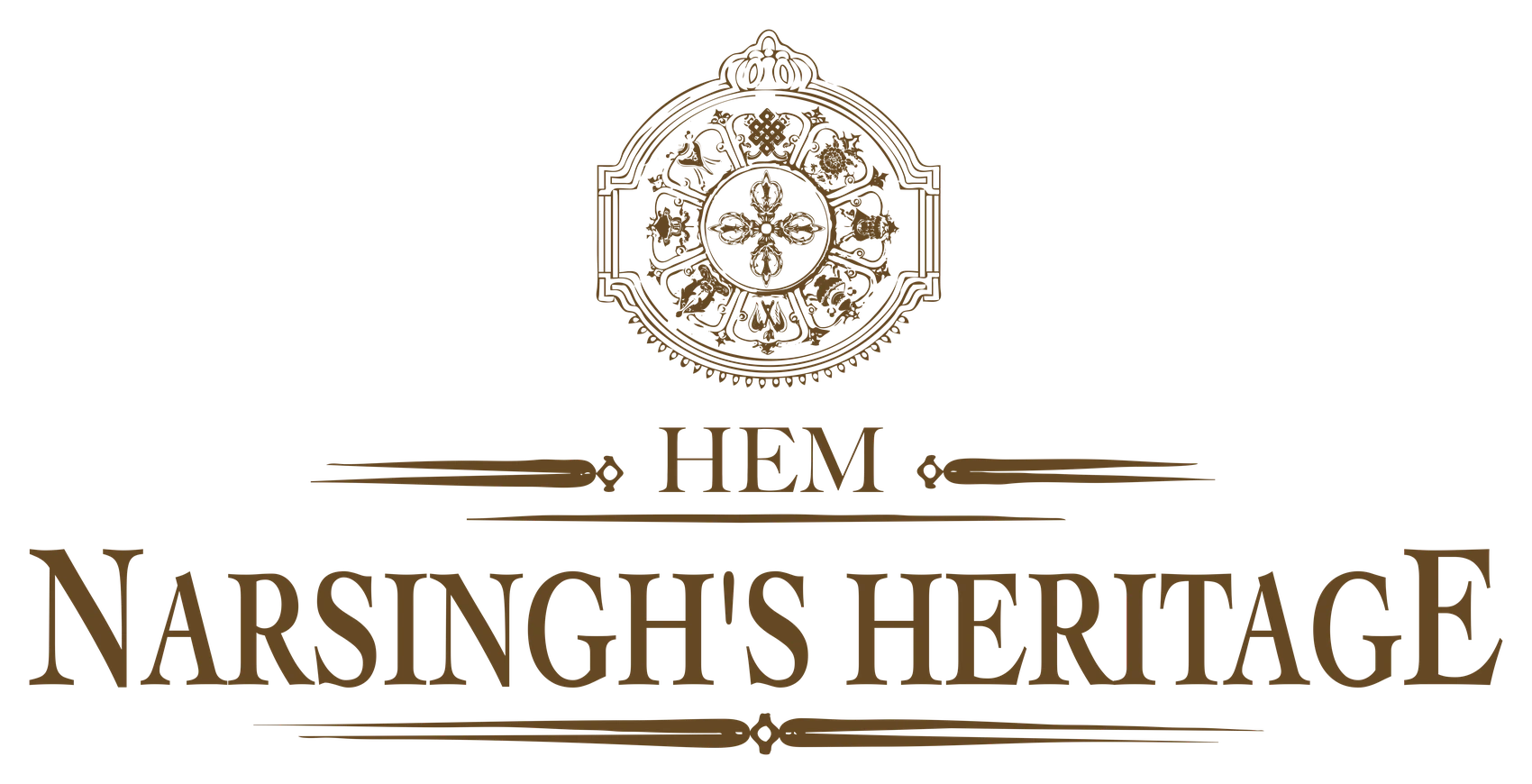
A crest for a heritage inn standing inside a UNESCO square, drawn so it could be engraved as easily as printed.
The mark is built as a medallion: a vishvavajra at the centre, the eight auspicious symbols set into the ring around it, and a crown rising off the top. It is drawn entirely in line, at a weight that survives being stamped small on a key fob and still holds together blown up across a brochure cover.
The wordmark is a high-contrast serif in caps, split across two lines by a drawn rule so that HEM reads as a prefix rather than as part of the name. Everything is one ink. The brochure then does the colour work, setting the whole system in gold on near-black with octagonal windows cut for the photography.
- Role
- Brand identity and print
- Deliverables
- Crest mark, Wordmark lockup, Four-page brochure, One-page advertisement
Applications
Elevate Nepal
World Bank Drone Ecosystem Acceleration Program
Mark
An event identity for the World Bank's drone programme in Nepal, cut as one-colour scratchboard so it could be printed on black cotton and black board without changing.
The mark quarters a diamond into the four things the programme is about: the aircraft overhead, the two operators flying it, the terrain they are flying over, and the city and the survey map that come out of the other end. Each quarter is engraved rather than filled, so the whole thing holds detail at a notebook's scale and still reads as a single shape across a chest.
Drawn white-out from the start. Every application in the kit is one ink on black, which is what let the same artwork go to a screen printer and a board printer with no second version of it.
- Role
- Event identity and merchandise
- Deliverables
- Event mark, Apparel artwork, Notebook

Applications
The Abode by Amma
Guest house, Kathmandu
Mark
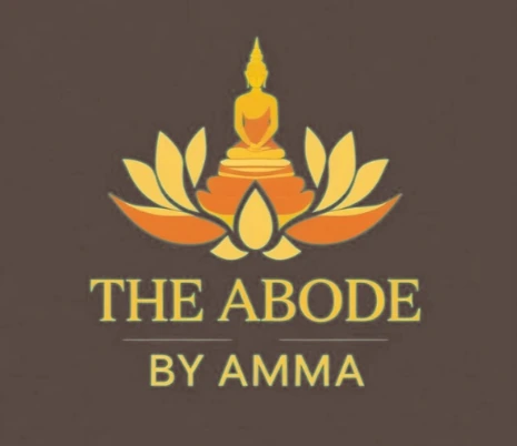
A lotus and a seated Buddha, worked up as a single silhouette so the mark survives being used at the size a doorplate allows.
The figure sits on the lotus rather than in front of it: the petals and the throne share one outline, which is what keeps the mark readable once it is small enough that the inner modelling disappears. The gradient runs warm through the petals and is the only place in the identity that carries more than one value.
The name is set in a high-contrast serif with a letterspaced sans sub-line under a drawn rule, and the poster carries that pairing through to the headline, so the room photography sits inside a system rather than beside a logo.
- Role
- Logo and print
- Deliverables
- Logo, Guest house poster
Applications
MailMate
Character mark
Mark
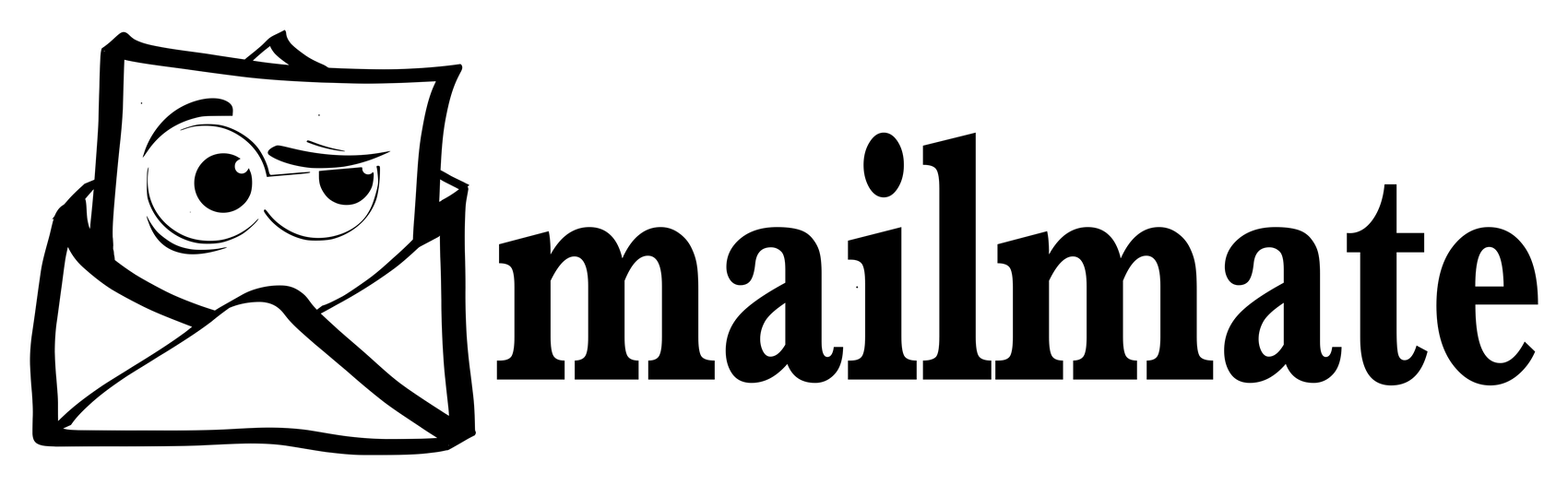
An envelope with an opinion about what is inside it, drawn by hand so the line keeps the wobble.
The whole mark is one brush weight, varied: the envelope is built from strokes that thin and swell the way a marker does, and none of the corners close cleanly. That is the point. Redrawn with a pen tool it becomes a stock mail icon, and the expression goes with it.
The face is doing the work. One eye wide and one half-lidded under a raised brow gives the shape a read at a favicon's size, where the envelope alone would be generic. The wordmark is set lowercase in a slab serif, weighted to match the stroke of the drawing so the two sit on the same line without the mark looking pasted on.
- Role
- Mark and wordmark
- Deliverables
- Character mark, Wordmark lockup